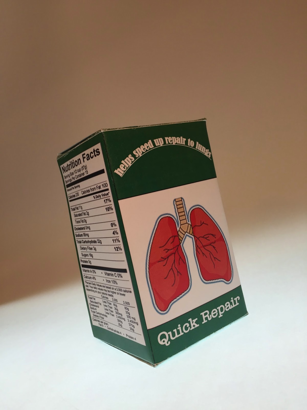
i learned so much about package design during this project and how to make a carton design. the hardest thing about this project was figuring a design i could use to respesent the look and design of what need to stand out on the box. i went with green cause it has a medicine kind of feel and i put red to represent the lungs for like health wise. i enjoyed this project a ton because it tapped into my imagination. My product is quick repair, this supplement is designed for smokers who have destroyed their lungs over time by smoking so i created this to help speed up the process of the lungs alloys being repaired and can cut down the process of healing by half the time of normal healing. I enjoyed making the color scheme and the design of the box and making it look very complex but simple at the same time.


No comments:
Post a Comment